

What is an HR dashboard? A practical guide for Australian teams
An HR dashboard is a business intelligence tool that centralises workforce data into a single visual interface, giving HR teams and business managers real-time access to the metrics that drive people decisions. Unlike a static report that documents what happened last quarter, a dashboard refreshes continuously to flag current trends and potential issues so leaders can act before problems escalate. HR professionals use it to monitor headcount, turnover, time-to-fill, engagement, and compliance in one place, rather than assembling data from scattered spreadsheets before every meeting. For Australian organisations, dashboards must also be built with the Australian Privacy Principles in mind, which governs how personal employee data is collected, stored, and displayed.
Table of Contents
- Why do HR dashboards matter for your business?
- Which KPIs should you include in an HR dashboard?
- What types of HR dashboards are there?
- How do you build an HR dashboard step by step?
- How should managers read and act on an HR dashboard?
- Where does HR dashboard data come from, and what are the privacy rules?
- What mistakes should you avoid with HR dashboards?
- How long does it take and what does it cost?
- Key takeaways
- The case for keeping it simple
- Workit makes HR reporting straightforward for Australian teams
- Useful sources
- FAQ
Why do HR dashboards matter for your business?
The clearest business case for an HR analytics dashboard is speed. When a hiring manager can see that time-to-fill for a critical role is significantly delayed, they can act promptly rather than waiting for the next monthly report. That shift from reactive reporting to proactive workforce management is where dashboards deliver their sharpest value.
Concrete business impacts include:
- Faster decisions: Leaders see current data without waiting for a manual report to be compiled.
- Proactive risk detection: Rising absenteeism or a spike in voluntary resignations surfaces as a trend, not a surprise.
- Workforce planning support: Headcount and attrition data feed directly into resourcing and budget conversations.
- Efficiency gains: HR teams spend less time pulling numbers and more time analysing them.
The use cases differ by audience. An executive needs a high-level people overview to track whether headcount and labour cost are on budget. An HR business partner uses a recruitment dashboard to spot bottlenecks in the hiring pipeline. A line manager checks a team performance view to see who needs a development conversation before the next review cycle. As Human Resources Director research shows, dashboards enable managers to spot patterns such as absenteeism pockets and recruitment bottlenecks, then drill down to take corrective action.
Linking turnover trends to cost is particularly persuasive with finance teams. When a dashboard shows higher voluntary turnover in one department, the conversation quickly shifts to what that costs in recruitment, onboarding, and lost productivity, making the business case for retention investment much easier to land.
Which KPIs should you include in an HR dashboard?
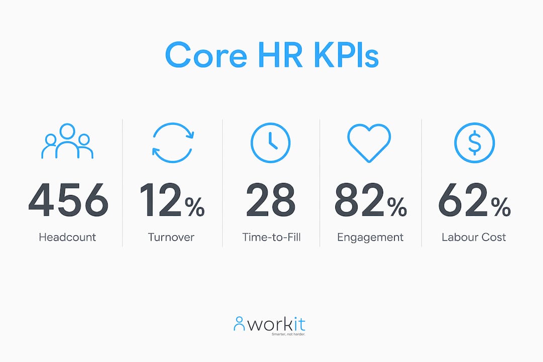
Effective HR dashboards typically include a focused set of core KPIs. Keeping the count tight improves focus and adoption; a dashboard with too many metrics is a report in disguise.
Pro Tip: Before you add a metric, ask: “What decision does this number change?” If you cannot answer that in one sentence, leave it out.
| KPI | Definition | Why it matters | Calculation / data source |
|---|---|---|---|
| Headcount & composition | Total active employees by type, level, or location | Baseline for all workforce planning | Employee records in your HRIS |
| Voluntary turnover rate | % of employees who resigned in a period | Signals culture, management, or pay issues | (Voluntary exits ÷ avg headcount) × 100 |
| Involuntary turnover rate | % of employees exited by the organisation | Flags performance or restructure activity | (Involuntary exits ÷ avg headcount) × 100 |
| Retention rate | % of employees who stayed over a period | Inverse of turnover; useful for cohort analysis | ((Start headcount − exits) ÷ start headcount) × 100 |
| Time-to-fill | Days from role approval to accepted offer | Measures hiring efficiency | Date offer accepted − date role opened |
| Cost-per-hire | Total recruiting spend ÷ number of hires | Links hiring activity to budget | (Internal + external recruiting costs) ÷ hires |
| Onboarding completion rate | % of new starters completing onboarding tasks on time | Predicts early engagement and short-term retention | Tasks completed ÷ tasks assigned × 100 |
| Engagement score | Aggregate from pulse or annual surveys | Leading indicator of retention and performance | Survey platform output |
| Absence rate | Unplanned leave days ÷ available working days | Flags wellbeing or team culture issues | Payroll or rostering system |
| Performance distribution | % of employees in each rating band | Checks for rating inflation or skew | Performance management system |
These core metrics provide a balanced view across resourcing, retention, performance, and cost. Compensation summary data, such as average salary by band or pay equity ratios, rounds out the picture when your dashboard audience includes finance or the remuneration committee.
What types of HR dashboards are there?
Dashboard type should follow audience, not technology. The five most common variants each serve a distinct set of questions.
Executive people overview The broadest view: total headcount, labour cost as a percentage of revenue, voluntary turnover trend, and engagement score. Typical widgets include a headcount waterfall chart, a turnover trend line, and a cost-per-FTE tile. The questions it answers: Are we growing as planned? Is attrition within acceptable bounds?

Recruitment dashboard Tracks the hiring pipeline from application to offer. Widgets typically include open roles by department, time-to-fill by role type, offer acceptance rate, and source-of-hire breakdown. A hiring manager can see at a glance where candidates are stalling and which sourcing channels are producing quality hires.

Performance and development dashboard Aggregates review completion rates, rating distributions, goal progress, and learning hours by team. Useful during calibration cycles. A manager looking at this view can see which teams have low review completion with two weeks left in the cycle, and act before the deadline passes.
Diversity and inclusion dashboard Shows workforce composition by gender, age band, cultural background, and leadership level, alongside pay equity ratios. Widgets often include a representation funnel from application to hire to promotion. This view supports both internal accountability and external reporting obligations.
Workforce planning dashboard Combines current headcount with attrition forecasts, open roles, and succession readiness scores. Useful for HR business partners preparing for budget cycles or restructures. A typical widget set includes a headcount-versus-plan tile, a flight-risk indicator, and a role-criticality matrix.
Role-based access is the design principle that ties all five types together: executives see high-level trend panels, managers see drilldowns for their own teams, and individual contributors see only what is relevant to them.
How do you build an HR dashboard step by step?
A question-first approach consistently outperforms a technology-first one. As HCMag research confirms, lean analytics capability and clear question definition often matter more than sophisticated tooling for delivering practical outcomes.
- Define your audience and their questions. Who will use this dashboard daily? What decisions do they need to make? Write three to five specific questions the dashboard must answer.
- Choose 5–10 core KPIs. Map each KPI to one of the questions from step one. If a metric does not answer a question, drop it.
- Map your data sources. Identify where each KPI lives: HRIS, payroll, ATS, LMS, or survey platform. Note the owner, update frequency, and any known data quality issues.
- Design wireframes. Sketch the layout before touching any tool. Decide which widgets appear above the fold and which require a drilldown.
- Validate KPI definitions. Agree on a single definition for each metric with HR, finance, and the relevant business owners. Document the formula, the data source, and who owns it.
- Build a prototype. Start with the three most-used KPIs. A working prototype with real data beats a polished mockup with placeholder numbers.
- Pilot with end users. Run a structured pilot with a small group for several weeks. Collect feedback on clarity, missing context, and data trust.
- Iterate and govern. Update definitions, fix data issues, and assign an owner for each KPI before rolling out more broadly.
Implementation checklist:
- Assign a named owner for each KPI (who is accountable for data quality?)
- Set a clear update cadence (daily, weekly, or monthly per metric)
- Define drilldown paths so users know where to go for more detail
- Set role-based access controls before go-live
- Document the change log so users know when definitions or sources change
Pro Tip: In an Australian context, a four-to-six-week pilot with a mixed group of HR business partners and line managers tends to surface the most useful feedback. Ask them to make one real decision using the dashboard each week and report back on what was missing.
How should managers read and act on an HR dashboard?
Reading a dashboard well is a skill, not an assumption. These habits separate managers who act on data from those who simply glance at it.
Reading checklist:
- Trend vs point-in-time: A single month’s turnover figure means little. Look at the three-to-six-month trend before drawing conclusions.
- Top-down to drilldown: Start at the summary level, then drill into the department or team where a number looks unusual.
- Correlation vs causation: Two metrics moving together does not mean one caused the other. Use the dashboard to form a hypothesis, then investigate.
- Confidence flags: If a metric is based on a small sample (fewer than 10 people in a team), treat it with caution and note the sample size.
Questions to ask when reviewing each KPI:
- Is this change seasonal, or is it a sustained trend?
- Which team, location, or role type is driving this number?
- What happened in the business during this period that might explain the shift?
- What is the cost or risk if this trend continues for another quarter?
- What one action could we take this week to move this metric in the right direction?
Different audiences need different update cadences. Executives typically review a people overview monthly or quarterly. HR business partners check recruitment and retention metrics weekly during active hiring periods. Line managers benefit from a fortnightly nudge during performance cycles.
Where does HR dashboard data come from, and what are the privacy rules?
Most HR dashboards combine data from payroll, recruiting, learning, and engagement systems to give a single view of workforce metrics. Getting that integration right is as important as the visualisation itself.
| Data source | Typical metrics supplied | Integration consideration |
|---|---|---|
| HRIS | Headcount, tenure, demographics, org structure | Master record; all other systems should map to HRIS employee IDs |
| Payroll | Compensation, absence, leave balances | Sync cadence matters; weekly or fortnightly is typical |
| ATS | Time-to-fill, source-of-hire, pipeline stage | Map role IDs consistently across systems |
| LMS | Training completion, hours, compliance modules | Completion status needs a clear pass/fail definition |
| Survey platform | Engagement score, eNPS, pulse results | Anonymisation thresholds must be set before display |
| Rostering / timekeeping | Hours worked, overtime, shift patterns | Critical for award compliance in Australian workplaces |
Australian privacy considerations:
- The Australian Privacy Principles (APPs) under the Privacy Act 1988 govern how personal employee information is collected, used, and disclosed. Any dashboard displaying identifiable employee data must comply.
- Apply the minimal data principle: display only what is needed for the decision at hand. Aggregate views (team-level, not individual) reduce privacy risk significantly.
- Set role-based access so managers see only their own team’s data. Executives see aggregated views unless there is a specific operational reason for more detail.
- De-identify aggregated views where group sizes fall below a threshold (commonly ten or fewer employees) to prevent re-identification.
- Maintain record-keeping obligations: document what data is held, where it is stored, and how long it is retained, consistent with the APPs and any applicable award or enterprise agreement.
For Fair Work compliance and audit readiness, your HRIS should be the single source of truth feeding the dashboard, with a clear audit trail for any changes to employee records.
What mistakes should you avoid with HR dashboards?
The most common dashboard failure is not technical. It is a governance failure: metrics with no agreed definition, data that nobody trusts, and a tool that gets abandoned after three months.
Frequent pitfalls:
- Too many KPIs: A dashboard with 25 metrics is not more useful than one with 10. It is less useful, because nothing stands out.
- Inconsistent definitions: If HR calculates turnover one way and finance calculates it another, every executive review becomes a debate about the numbers rather than the decisions.
- Stale data: A dashboard that has not refreshed in three weeks is worse than no dashboard, because it creates false confidence.
- Dashboard as surveillance: Displaying individual-level performance data to senior leaders without context breeds distrust. Dashboards should inform and support managers, not micro-monitor individuals.
- Failure to test assumptions: Building a dashboard around a metric that turns out to be poorly defined or inconsistently captured wastes everyone’s time.
Governance rules that keep dashboards reliable:
- Define a single source of truth for each KPI before building any visualisation, including the owner, formula, data source, and update frequency. This prevents the recurring “which number is right?” debate in executive reviews.
- Schedule monthly data quality checks and assign a named data steward for each source system.
- Maintain a change log so users know when a definition or data source has changed.
- Communicate changes to dashboard users before they go live, not after someone notices the numbers shifted.
When introducing a new dashboard to a team, frame it as a tool for the team’s benefit, not a monitoring mechanism. Transparency about what is tracked and why builds trust faster than any technical feature.
How long does it take and what does it cost?
Realistic timelines depend heavily on data readiness, not on the tool you choose.
A basic prototype covering core KPIs from a single HRIS source typically takes several weeks from kickoff to a working version. A pilot with a defined user group runs for a few months, including feedback loops and definition refinements. An organisation-wide roll-out across multiple dashboards, audiences, and integrated data sources realistically takes several months.
The main cost drivers in an Australian context:
- Data readiness: Messy, inconsistent, or siloed data is the single biggest cost multiplier. Cleaning and mapping data before building saves time overall.
- Number of integrations: Each additional source system (payroll, ATS, LMS) adds integration complexity and testing time.
- Custom visualisation: Off-the-shelf dashboard templates in a commercial HRIS cost far less than custom-built BI solutions.
- Licence model: Per-user pricing suits small HR teams; per-employee pricing (such as Workit’s $5 per employee per month model) scales more predictably as headcount grows.
- Local support and training: Australian-based support reduces the time lost to time-zone gaps and generic advice that does not account for local award conditions or Fair Work obligations.
For most small-to-mid-sized Australian businesses, starting with a commercial HRIS platform that includes prebuilt reporting is faster and more cost-effective than building a custom BI solution from scratch. A simple monthly spreadsheet dashboard with five well-defined metrics, kept current, often outperforms an elaborate system that nobody maintains.
Key takeaways
An HR dashboard delivers its greatest value when it is built around clear questions, governed by agreed definitions, and kept current with reliable data from integrated source systems.
| Point | Details |
|---|---|
| Start with questions, not metrics | Define what decisions the dashboard must support before choosing any KPI. |
| Limit to 7–10 core KPIs | Fewer, well-defined metrics drive better adoption and faster decisions than a crowded screen. |
| Govern before you build | Document the owner, formula, and data source for each KPI before any visualisation work begins. |
| Apply Australian privacy rules | Display aggregated views, set role-based access, and comply with the Australian Privacy Principles under the Privacy Act 1988. |
| Workit simplifies the build | Workit’s all-in-one platform includes prebuilt HR metrics, payroll and ATS integrations, and role-based reporting at $5 per employee per month. |
The case for keeping it simple
There is a persistent myth in HR analytics that better dashboards require more sophisticated technology. The organisations I see getting the most value from their people data are not the ones with the most complex BI stacks. They are the ones where HR and finance agreed on five definitions, built something simple, and actually used it every fortnight.
The surveillance concern is real and worth naming directly. When a dashboard is introduced without explanation, people assume the worst. The teams that get this right are transparent about what is tracked, who can see it, and why. That conversation, not the technology, is what determines whether a dashboard builds trust or erodes it.
For Australian HR teams, the privacy obligations under the APPs add a layer of discipline that is actually useful. The requirement to minimise data, aggregate where possible, and document what you hold forces good design decisions that make dashboards more trustworthy, not just more compliant.
Start small. Pick one pressing business question. Build the simplest dashboard that answers it with data you already have. Then iterate. That approach works for a 20-person business and a 2,000-person enterprise alike.
Workit makes HR reporting straightforward for Australian teams
Getting your first HR dashboard off the ground does not have to mean months of integration work or a complex BI project. Workit is built specifically for Australian businesses, with prebuilt HR reporting that covers the core metrics your team needs from day one: headcount, turnover, onboarding completion, time-to-fill, and compliance status, all in one platform.
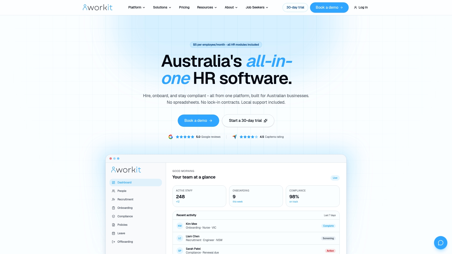
Every Workit module is included at $5 per employee per month, with no hidden fees and no per-module add-ons. Payroll, ATS, and LMS integrations are supported out of the box, and role-based access controls mean your managers see their team’s data while executives get the high-level view. Local support from a team that understands Australian award conditions and Fair Work obligations means you get practical answers, not generic advice.
Ready to see it in action? Book a demo and view a live dashboard built for Australian teams.
Useful sources
- Visier: HR Dashboards — Definition, Benefits and Examples — Comprehensive reference on dashboard definitions, role-based design, and the distinction between dashboards and static reports.
- HR University: Core HR Metrics and KPI Guidance — Practical guidance on selecting and limiting KPIs, with definitions for common workforce metrics.
- HCMag / Human Resources Director: Data and Analytics Transforming HR — Australian-focused research on how managers use dashboards to shift from reactive to proactive workforce management.
- Navigo: How to Build an HR Dashboard (Australian HR consultancy) — Step-by-step build process with pilot advice relevant to Australian organisations.
- Gusto: HR Dashboard Glossary — Clear overview of integration patterns and common data sources feeding modern dashboards.
- Workit: HR Metrics You Should Track — Workit’s own guide to defining a single source of truth for each KPI, including owner, formula, and data source documentation.
FAQ
What is an HR dashboard used for?
An HR dashboard centralises workforce metrics such as headcount, turnover, time-to-fill, and engagement into a single visual interface, giving HR teams and managers the data they need to make faster, better-informed people decisions without manually compiling reports.
How do you build an HR dashboard?
Start by defining the three to five questions your audience needs to answer, then select 7–10 core KPIs, map each to a data source, agree on definitions with HR and finance, build a prototype, and run a four-to-six-week pilot with real users before a broader roll-out.
What are the four main types of HR dashboards?
The most common types are the executive people overview, the recruitment dashboard, the performance and development dashboard, the diversity and inclusion dashboard, and the workforce planning dashboard. Each is designed for a specific audience and set of decisions.
How should managers read an HR dashboard?
Look at trends over three to six months rather than a single data point, drill from the summary level into the team or role driving an unusual number, and ask what business event might explain any shift before drawing conclusions or taking action.
Can Workit provide a ready-made HR dashboard for Australian businesses?
Yes. Workit includes prebuilt reporting covering core HR metrics, with payroll and ATS integrations and role-based access controls, all at $5 per employee per month with no hidden fees. You can view a live demo to see the reporting module in action.
This article is general information only and does not constitute legal, privacy, or professional HR advice. Confirm your obligations under the Australian Privacy Principles and Fair Work Act with a qualified adviser or the relevant primary source for your specific situation.